Overview
The eResearch Regulatory Management (eRRM) system upgrade to 9.0, effective March 1, 2020, brings a number of user interface changes and navigation improvements to the smartforms for Human Subjects (HUM), Institutional Biosafety (IBCA), Participating Site (SITE), and Repository (REP) Applications.
Contents
Smartform Changes
Navigation
The Navigation Bar that previously displayed at the top and bottom of the smartform has changed.
Old look (displayed navigation bar at top and bottom of smartform)

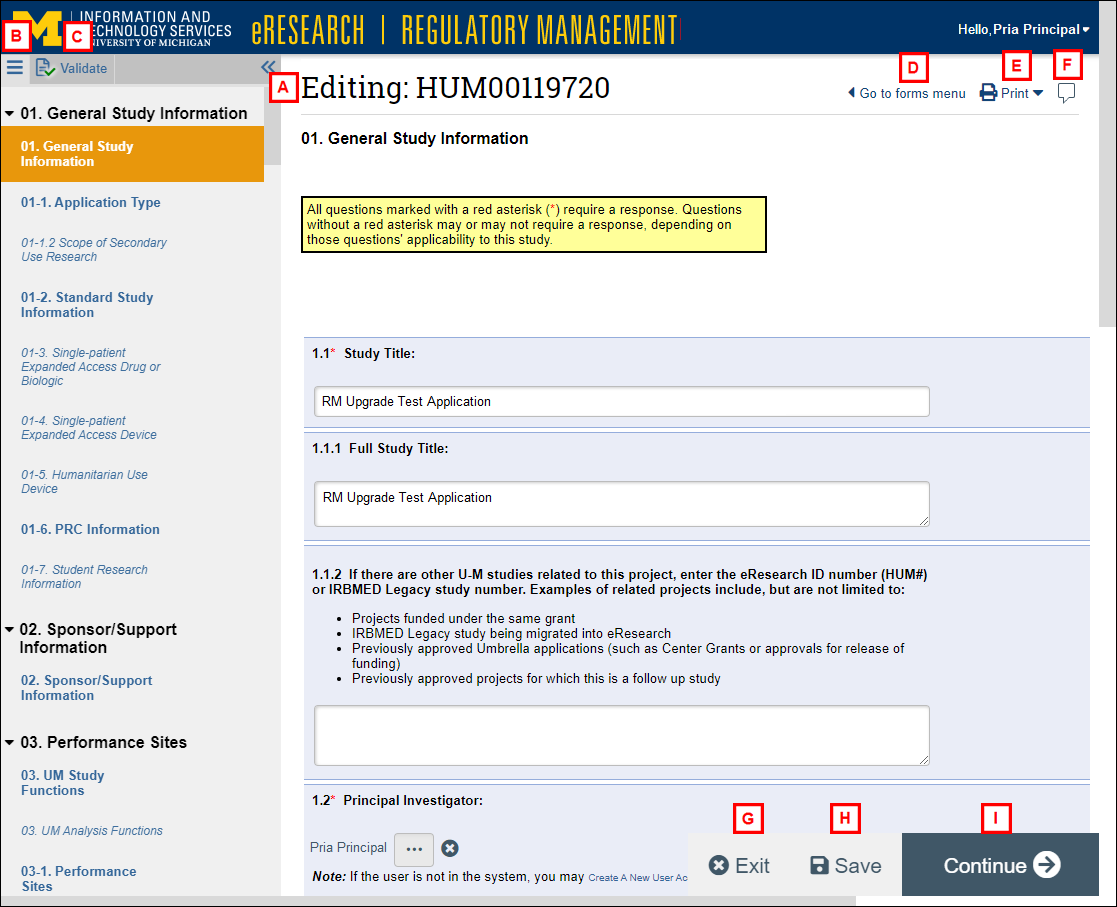
- The submission ID now displays more prominently at the top of the smartform, e.g., "Editing: HUM00119720".
- Forms menu bars replaces the Jump To list, and it has moved to the left navigator. It displays all the sections and pages in an application. See Forms Menu for more details.
- check Validate replaces Hide/Show Errors, and it has moved to the left navigator. Click to run project validation/error checking. See Validate for more details.
- left Go to forms menu Shifts the focus from the smartform to the forms menu, i.e., it opens the forms menu if it was closed.
- print Print Print this page or this project to open a printer-friendly version. See Print for more details.
- comment Reviewer Notes (for Study Team Members with Edit rights to the application) are located at the top-right corner of the smartform.
- H. I. Buttons to exit Exit, save Save, and Continue right arrow float at the bottom-right corner of the smartform. They always display, and you don't have to scroll to view them.
Tip Use Continue to advance to the next required page in the application.
New look
Forms Menu
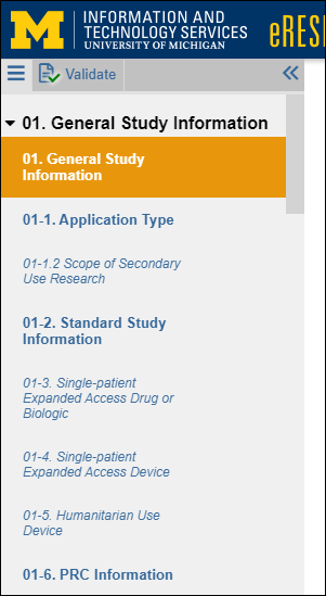
The forms menu bars replaces the Jump To list. It persistently displays a list of sections and pages within an application.
old look (drop-down list of pages)

The entire left navigator can be toggled on or off, i.e., closed left or opened right with the double-arrow icon.
- The page that you are currently viewing is in bold and highlighted.
- Click on a top-level bold section number, e.g. 01. General Study Information, to expand right (right) or collapse down (down) the pages within that section in the forms menu.
- Pages that are not required for your project appear in italics.
- The Continue right arrow button at the bottom of the smartform will take you to the next bold (required) section number, bypassing sections in italics.
New look
Validate
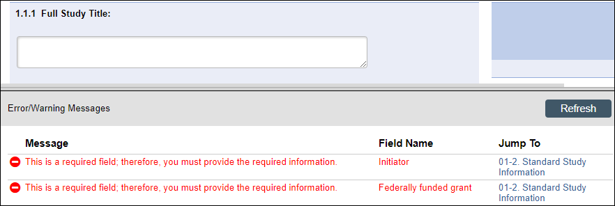
Validate replaces Hide/Show Errors. It is located within the forms menu.
Old look (displayed Error/Warning Messages in a bottom panel)
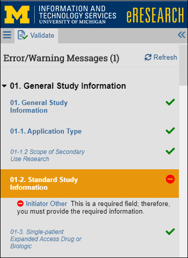
Click check Validate to run project validation and view Error/Warning Messages. Pages/questions with green checkmarks checkmark indicate verification/completion, and red circles minue indicate incompletion and/or warnings.
Note Pages that are not required will also get a green checkmark checkmark.
New look
The print Print down drop-down list has two options:
- This page (opens a Printer-Friendly view of the current page in another browser tab)
- This project (opens a Printer-Friendly view of the entire application in another browser tab)
Slide-ins
When entering information for questions that have Add, Update, or Browse... buttons, the additional fields that used to open as separate "pop-up" browser windows now slide in from the right side of the smartform. For example, when browsing for another department in question 1-2.3, the "Select Organization" window slides in.
Note The window can be minimized minimize or closed close to return to the main smartform, but you must click OK to save your selection.
Slide-in example
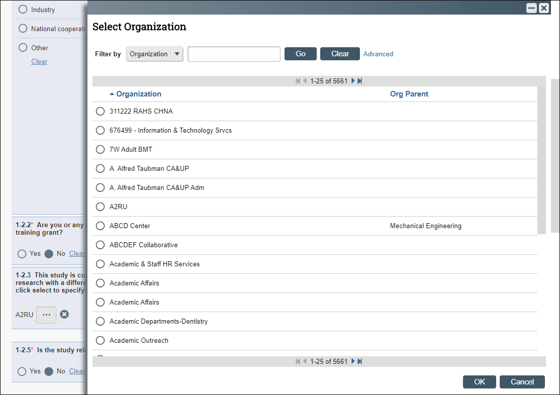
The slide-in windows are also called Dialogs. If you've minimized a slide-in and returned focus to the main smartform, then options to Close close and Restore restore Dialogs display in a bar on the right-side of the smartform.
Note The main smartform controls remain locked for editing until you close the slide-in dialog.
Slide-in minimized

Appointment Selection (for Human Subjects Applications)
The Appointment Selection functionality for Study Team Members is improved and easier to use. It now displays the available appointments directly within the slide-in question.
Document controls
When working with documents, there is a new location for the buttons/controls on document stacks. Click the Browse browse ellipsis button next to the Version number for options to:
- download Download Copy
- upload Upload Revision
- history View History
- compare Compare with Previous Version
- delete Delete.
Note The options that are available may vary based on document-type and user role.
New document controls

Continue where you left off
The system remembers where you last were within an application. A "Welcome Back! Continue where you left off" message displays, and the application opens directly to the last page of the application that you had saved.
Video
See a brief demonstration of these user interface changes in this eRRM 9.0 video video (02:45 - Note: no audio).
Reviewer Notes Interfacecomment Reviewer Notes have a new interface and improved functionality. The notes that previously displayed at the top of the smartform, now display in a new pop-up window. Within the Reviewer Notes window, there are options to:
- Select Reviewer Note Type
- enter notes
- Edit/Delete Study Team Notes
- Attach Files (or drag-and-drop a file)
- check/uncheck Response Required
- Reply, Resolve this thread, or Reactivate this thread
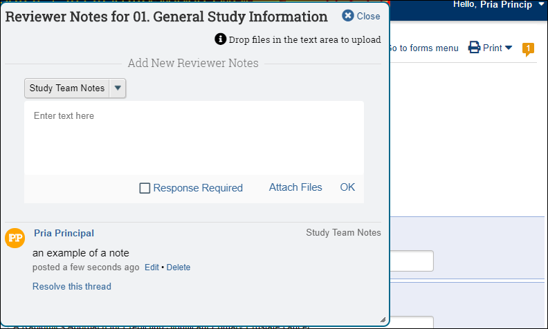
As notes are added, the quote icon comment incrementally displays the number of notes in the upper-right corner of the smartform, and on the Forms menu.

See the following videos by Huron for a demonstration of the smartform changes.
- video What’s New in the SmartForm ( Note: Print packets (01:54 - 02:14) do not apply to U-M's configuration. Compare (03:07 - 04:01) do not apply to HUMs.)
- video Tips for Completing a SmartForm (see Slide-ins at 02:15 - 03:03 and Document controls at 05:14 - 05:54.)
- video Validate SmartForm Data (shows new Forms Menu and Validate)
